Work
Sign up & on-boarding
Sep 2021 | The Guardian
Identity is the name of the team responsible for 14m and counting, users data. Managed in house until 2019 when they decided to partner with Okta a third party data management and security expert.
I joined the team as a UI designer mid way through the migration. Sign in, register, on-boarding journey and members area had all been worked on at different times over time. The result was different visual language across these pages leading to a disjointed user experience.
After auditing all the pages and noting down the different headers, typography styles, colour palettes and iconography. I set about simplifying and refining the design to create a consistent look, with a recognisable Guardian feel.
When UX did some user testing of the on-boarding journey the feedback was it took too long to complete with too many steps. But the needs of the business, supporter revenue, legal (data privacy), newsletters (editorial) dictated each of the four steps of the onboarding journey.

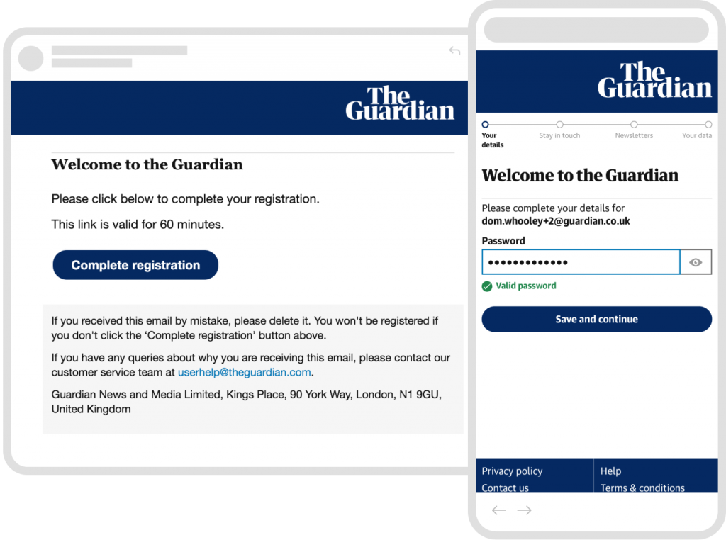
Check your email
In order to avoid users creating accounts using other peoples details, email confirmation is required. A simple email design follows the same consistent language.
50k
New registrations/ week
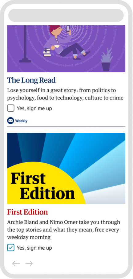
Newletters
Creating a Guardian account is the first step on a Guardian users journey. Data suggests that users that sign up to Guardian newsletter are more likely to become contributors or subscribers.
Data suggests that users that sign up to Guardian newsletter are more likely to become contributors or subscribers.


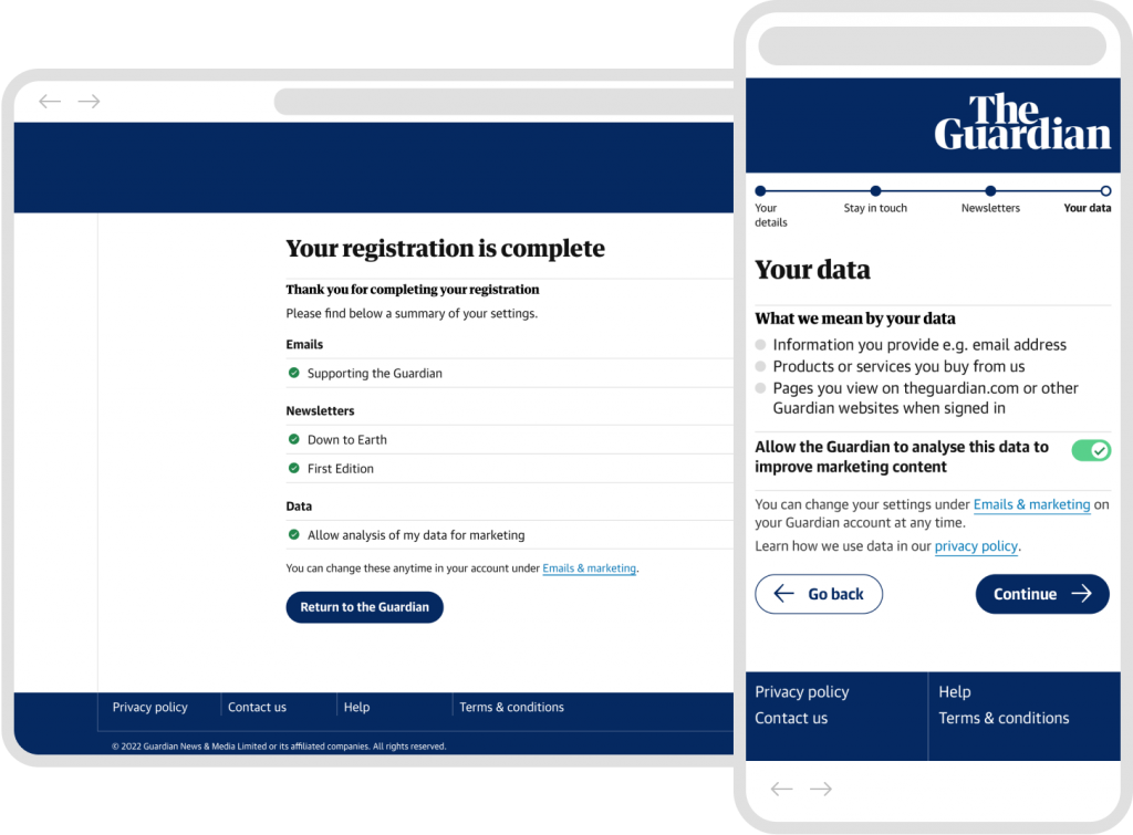
Your data
Guardian. One difficult challenge was not how to get users to opt in, but how to them to not opt-out of allowing the Guardian to profit from their data. Ana the UX on the project cleverly included the toggle switch. Not the natural choice for a toggle switch in this scenario but solved a problem with the label copy with a checkbox and made it clear to the user what was happening.
14m
Total accounts